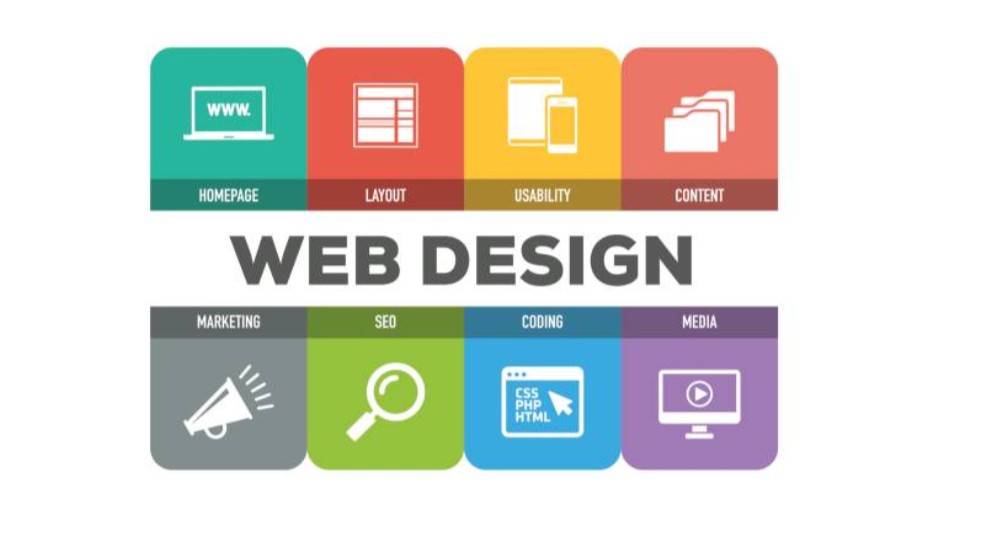
This comprehensive five-day training course is designed to equip participants with the essential knowledge and practical skills to create websites that adapt seamlessly to various screen sizes and devices. Participants will gain a thorough understanding of the principles, techniques, and best practices of responsive web design, enabling them to build user-friendly and accessible websites that provide optimal viewing experiences across desktops, laptops, tablets, and smartphones.
The course will cover a range of critical topics, including HTML5 structure, CSS3 layout techniques, media queries, flexible grids and images, responsive navigation, mobile-first design, testing and debugging responsive websites, performance optimization, and emerging trends in responsive web design. Through interactive sessions and hands-on projects, participants will develop the competencies to design, develop, and deploy responsive websites that meet the demands of today's multi-device web landscape.
Who should attend the training
- Web designers
- Web developers
- Front-end developers
- UI/UX designers
- Graphic designers
- Webmasters
- Digital marketers
- Content creators
- Anyone involved in website development and management
Objectives of the training
- Understand the principles and importance of responsive web design.
- Master HTML5 structure and semantic markup for responsive layouts.
- Become proficient in using CSS3 for flexible grids, layouts, and styling.
- Learn to implement media queries for device-specific styling.
- Develop skills in creating flexible images and media.
- Design and implement responsive navigation menus.
- Understand the mobile-first design approach.
- Learn techniques for testing and debugging responsive websites.
- Optimize website performance for various devices.
- Understand accessibility considerations in responsive design.
- Explore advanced responsive design patterns and techniques.
- Learn about CSS frameworks for responsive development.
- Understand cross-browser compatibility issues in responsive design.
- Develop strategies for handling different screen orientations.
- Learn about responsive typography and text styling.
- Understand the role of JavaScript in enhancing responsive design.
- Explore emerging trends and technologies in responsive web design.
- Develop a portfolio of responsive web design projects.
Personal benefits
- Enhanced skills in designing and developing responsive websites.
- Improved ability to create websites that work seamlessly across devices.
- Increased proficiency in HTML5, CSS3, and JavaScript for responsive design.
- Greater understanding of user experience (UX) principles in a mobile-first world.
- Expanded career opportunities in the field of web development.
Organizational benefits
- Improved user experience and engagement on company websites.
- Increased website traffic and conversions from mobile devices.
- Reduced website development and maintenance costs.
- Enhanced brand consistency across different platforms.
- Improved search engine optimization (SEO) and website ranking.
- Increased accessibility of websites for all users.
Training methodology
- Interactive lectures and presentations
- Group discussions and brainstorming sessions
- Hands-on coding exercises and workshops
- Practical session: Building a responsive website layout using HTML5 and CSS3.
- Live demonstrations of responsive design techniques
- Practical session: Implementing media queries for different screen sizes.
- Case studies of successful responsive websites
- Practical session: Designing a responsive navigation menu.
- Individual and group projects
- Practical session: Optimizing images for responsive websites
- Use of code editors and developer tools
- Practical session: Testing and debugging a responsive website.
- Peer review and feedback sessions
- Practical session: Creating a responsive web page with a mobile-first approach.
Course duration: 5 days
Training fee: USD 2500
Module 1: Introduction to Responsive Web Design
- Understanding the evolution of the web and the rise of mobile devices.
- Defining responsive web design and its importance.
- The business benefits of responsive design.
- Key principles of responsive design: flexibility, adaptability, and fluid grids.
- The mobile-first approach vs. desktop-first.
- Practical session: Analyzing the responsiveness of existing websites.
Module 2: HTML5 Structure and Semantic Markup
- HTML5 semantic elements (<header>, <nav>, <main>, <article>, <section>, <footer>).
- Creating a basic HTML5 structure for a responsive layout.
- Using HTML5 for accessibility and SEO.
- Best practices for HTML5 markup in responsive design.
- Understanding the <viewport> meta tag.
- Practical session: Structuring a web page using HTML5 semantic elements.
Module 3: CSS3 Layout Techniques
- CSS3 box model and layout properties (display, float, position).
- Introduction to CSS3 Flexbox and Grid layout.
- Creating flexible and fluid layouts with Flexbox and Grid.
- Understanding CSS3 media queries.
- Combining Flexbox and Grid for complex layouts.
- Practical session: Creating a two-column layout using Flexbox or Grid.
Module 4: Media Queries
- Understanding media query syntax and features.
- Using media queries for different screen sizes, orientations, and resolutions.
- Applying media queries to CSS styles for responsiveness.
- Combining multiple media queries.
- Best practices for writing efficient media queries.
- Practical session: Implementing media queries to change styles based on screen width.
Module 5: Flexible Grids and Layouts
- Understanding grid systems and their role in responsive design.
- Creating fluid grids using percentages and relative units.
- Using CSS Grid Layout for advanced grid systems.
- Nesting grids for complex layouts.
- Responsive grid frameworks (e.g., Bootstrap Grid System).
- Practical session: Building a responsive grid system from scratch.
Module 6: Flexible Images and Media
- Understanding the importance of image optimization in responsive design.
- Using CSS to make images responsive (max-width, height: auto).
- Using the HTML5 <picture> element for responsive images.
- Implementing responsive video and audio.
- Techniques for serving different image sizes based on device.
- Practical session: Making images responsive using CSS and the <picture> element.
Module 7: Responsive Navigation
- Designing navigation menus for different screen sizes.
- Implementing responsive navigation patterns (e.g., hamburger menus, dropdowns).
- Using CSS transitions and animations for navigation.
- Accessibility considerations for responsive navigation.
- Best practices for mobile navigation design.
- Practical session: Creating a responsive navigation menu with a hamburger icon.
Module 8: Mobile-First Design
- Understanding the mobile-first approach and its benefits.
- Designing for small screens first and progressively enhancing for larger screens.
- Using CSS media queries with the mobile-first approach.
- Best practices for mobile UX and design.
- Optimizing content and functionality for mobile devices.
- Practical session: Converting a desktop-first design to mobile-first.
Module 9: Testing and Debugging Responsive Websites
- Testing responsive websites on real devices and emulators.
- Using browser developer tools for debugging.
- Cross-browser compatibility testing.
- Identifying and fixing common responsive design issues.
- Using online testing tools and services.
- Practical session: Using browser developer tools to inspect and debug a responsive layout.
Module 10: Performance Optimization
- Understanding the importance of website performance in responsive design.
- Optimizing images for faster loading.
- Minifying CSS and JavaScript files.
- Using browser caching techniques.
- Implementing lazy loading for images and content.
- Practical session: Optimizing a website for faster loading on mobile devices.
Module 11: Accessibility Considerations
- Understanding web accessibility guidelines (WCAG).
- Ensuring responsive websites are accessible to users with disabilities.
- Using ARIA attributes for accessibility.
- Testing for accessibility issues.
- Best practices for accessible responsive design.
- Practical session: Making a responsive website accessible to screen reader users.
Module 12: CSS Frameworks for Responsive Development
- Introduction to CSS frameworks (e.g., Bootstrap, Foundation).
- Using a CSS framework to build responsive layouts.
- Customizing and extending CSS frameworks.
- Choosing the right framework for a project.
- Best practices for using CSS frameworks in responsive design.
- Practical session: Building a responsive website using a CSS framework.
Module 13: Cross-Browser Compatibility
- Understanding cross-browser compatibility issues in responsive design.
- Testing and debugging websites in different browsers.
- Using CSS resets and normalizers.
- Addressing browser-specific CSS prefixes.
- Strategies for ensuring cross-browser compatibility.
- Practical session: Testing a responsive website in multiple browsers and fixing compatibility issues.
Module 14: Handling Screen Orientations
- Understanding screen orientations (portrait and landscape).
- Using CSS media queries to adapt layouts for different orientations.
- Designing for both portrait and landscape modes on mobile devices.
- Best practices for handling orientation changes.
- Practical session: Adapting a website layout for both portrait and landscape orientations.
Module 15: Responsive Typography and Text Styling
- Choosing appropriate fonts for responsive websites.
- Using relative units (em, rem) for font sizes.
- Implementing responsive typography techniques.
- Handling line length and readability on different screen sizes.
- Best practices for responsive text styling.
- Practical session: Implementing responsive typography on a web page.
Module 16: JavaScript and Responsive Design
- Using JavaScript to enhance responsive design.
- Handling JavaScript events for different devices.
- Implementing responsive animations and interactions.
- Using JavaScript libraries for responsive development.
- Best practices for using JavaScript in responsive design.
- Practical session: Using JavaScript to create a responsive image slider.
Module 17: Advanced Responsive Design Patterns
- Exploring advanced responsive design patterns (e.g., off-canvas menus, carousels).
- Implementing adaptive design techniques.
- Using progressive enhancement and graceful degradation.
- Understanding the future of responsive design.
- Best practices for implementing advanced patterns.
- Practical session: Implementing an off-canvas menu for a responsive website.
Module 18: Responsive Design Project
- Planning and designing a complete responsive website.
- Developing the website using HTML5, CSS3, and JavaScript.
- Testing and optimizing the website for different devices.
- Presenting and documenting the project.
- Receiving feedback and iterating on the design.
- Practical session: Developing and presenting a final responsive web design project.
Requirements:
· Participants should be reasonably proficient in English.
· Applicants must live up to Phoenix Training Center admission criteria.
Terms and Conditions
1. Discounts: Organizations sponsoring Four Participants will have the 5th attend Free
2. What is catered for by the Course Fees: Fees cater for all requirements for the training – Learning materials, Lunches, Teas, Snacks and Certification. All participants will additionally cater for their travel and accommodation expenses, visa application, insurance, and other personal expenses.
3. Certificate Awarded: Participants are awarded Certificates of Participation at the end of the training.
4. The program content shown here is for guidance purposes only. Our continuous course improvement process may lead to changes in topics and course structure.
5. Approval of Course: Our Programs are NITA Approved. Participating organizations can therefore claim reimbursement on fees paid in accordance with NITA Rules.
Booking for Training
Simply send an email to the Training Officer on training@phoenixtrainingcenter.com and we will send you a registration form. We advise you to book early to avoid missing a seat to this training.
Or call us on +254720272325 / +254725012095 / +254724452588
Payment Options
We provide 3 payment options, choose one for your convenience, and kindly make payments at least 5 days before the Training start date to reserve your seat:
1. Groups of 5 People and Above – Cheque Payments to: Armstrong Global Training & Development Center Limited should be paid in advance, 5 days to the training.
2. Invoice: We can send a bill directly to you or your company.
3. Deposit directly into Bank Account (Account details provided upon request)
Cancellation Policy
1. Payment for all courses includes a registration fee, which is non-refundable, and equals 15% of the total sum of the course fee.
2. Participants may cancel attendance 14 days or more prior to the training commencement date.
3. No refunds will be made 14 days or less before the training commencement date. However, participants who are unable to attend may opt to attend a similar training course at a later date or send a substitute participant provided the participation criteria have been met.
Tailor Made Courses
This training course can also be customized for your institution upon request for a minimum of 5 participants. You can have it conducted at our Training Centre or at a convenient location. For further inquiries, please contact us on Tel: +254720272325 / +254725012095 / +254724452588 or Email training@phoenixtrainingcenter.com
Accommodation and Airport Transfer
Accommodation and Airport Transfer is arranged upon request and at extra cost. For reservations contact the Training Officer on Email: training@phoenixtrainingcenter.com or on Tel: +254720272325 / +254725012095 / +254724452588